当前位置:
X-MOL 学术
›
Color Res. Appl.
›
论文详情
Our official English website, www.x-mol.net, welcomes your
feedback! (Note: you will need to create a separate account there.)
Experimental study on the relationship between the harmony and cognitive load of business intelligence dashboard color combinations
Color Research and Application ( IF 1.2 ) Pub Date : 2021-12-14 , DOI: 10.1002/col.22768 Qi Wu 1 , Zhanglu Tan 1 , Jie Liu 1
Color Research and Application ( IF 1.2 ) Pub Date : 2021-12-14 , DOI: 10.1002/col.22768 Qi Wu 1 , Zhanglu Tan 1 , Jie Liu 1
Affiliation
|
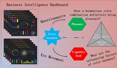
The color combination is an important factor affecting dashboard visual design and is key to triggering the operator's visual harmony and emotion. However, in the actual design process, the relationship among the different color schemes of a dashboard and the operator's harmony, pleasure, and cognitive load has not been effectively analyzed. To solve this problem, two methods, questionnaire measurement and eye movement tracking, were used to evaluate the effects of 24-color combinations under four-color schemes of a dashboard by analyzing the changes in color harmony, pleasure, eye movement indicators. The four schemes were red–yellow–blue, green–purple–orange, blue green–blue purple–yellow green, and red orange–yellow orange–red purple. The research results show that the degrees of color harmony and pleasure show a positive correlation. Cognitive load is not affected by color harmony. The larger the amount of information, the higher the cognitive load. This research can be used as a reference when designing and optimizing the color scheme of a business intelligence dashboard.
中文翻译:

商业智能仪表盘颜色组合和谐度与认知负荷关系的实验研究
颜色组合是影响仪表板视觉设计的重要因素,是触发操作者视觉和谐感和情感的关键。然而,在实际设计过程中,仪表板的不同配色方案与操作者的和谐、愉悦和认知负荷之间的关系并没有得到有效的分析。针对这一问题,采用问卷测量和眼动追踪两种方法,通过分析色彩和谐度、愉悦感、眼动指标的变化,评估仪表盘四色方案下24色组合的效果。四种方案分别为红-黄-蓝、绿-紫-橙、蓝绿-蓝紫-黄绿、红橙-黄橙-红紫。研究结果表明,色彩和谐程度与愉悦程度呈正相关。认知负荷不受色彩和谐的影响。信息量越大,认知负荷越高。在设计和优化商业智能仪表板的配色方案时,这项研究可以作为参考。
更新日期:2021-12-14
中文翻译:
商业智能仪表盘颜色组合和谐度与认知负荷关系的实验研究
颜色组合是影响仪表板视觉设计的重要因素,是触发操作者视觉和谐感和情感的关键。然而,在实际设计过程中,仪表板的不同配色方案与操作者的和谐、愉悦和认知负荷之间的关系并没有得到有效的分析。针对这一问题,采用问卷测量和眼动追踪两种方法,通过分析色彩和谐度、愉悦感、眼动指标的变化,评估仪表盘四色方案下24色组合的效果。四种方案分别为红-黄-蓝、绿-紫-橙、蓝绿-蓝紫-黄绿、红橙-黄橙-红紫。研究结果表明,色彩和谐程度与愉悦程度呈正相关。认知负荷不受色彩和谐的影响。信息量越大,认知负荷越高。在设计和优化商业智能仪表板的配色方案时,这项研究可以作为参考。


 京公网安备 11010802027423号