
Abstract
Error analysis and data visualization of positive COVID-19 cases in 27 countries have been performed up to August 8, 2020. This survey generally observes a progression from early exponential growth transitioning to an intermediate power-law growth phase, as recently suggested by Ziff and Ziff. The occurrence of logistic growth after the power-law phase with lockdowns or social distancing may be described as an effect of avoidance. A visualization of the power-law growth exponent over short time windows is qualitatively similar to the Bhatia visualization for pandemic progression. Visualizations like these can indicate the onset of second waves and may influence social policy.
Export citation and abstract BibTeX RIS

Original content from this work may be used under the terms of the Creative Commons Attribution 4.0 licence. Any further distribution of this work must maintain attribution to the author(s) and the title of the work, journal citation and DOI.
1. Introduction
Mathematical modeling is essential to predict and control the course of pandemics [1, 2]. Many epidemiological theories derive from the SIR model or a more sophisticated version of it containing more categories [3–5]. The basic SIR model may not be sufficient to characterize COVID-19 for several reasons. The parameters of SIR, like the basic reproduction number, can change over time according to the sequence of social policies [6]. In comparison, the parameters of flu or colds remain constant except for potential seasonal variations because people continue to go about their business. The time course of parameters like the basic reproduction number may only be computable retrospectively. The SIR equations are also entirely deterministic, while in real systems, there is some stochastic element of variation. Differential equations do not take into account the integer nature of population categories over time, especially in the initial stages. The SIR model has a difficult to compute solution [7]. SIR model dynamics lumps susceptible people into one category, whereas some groups are more at risk of contracting the virus than others. Spreading the virus may also depend on differences in demographics, employment, city size, social networks, social dynamics, or individual behaviors [8]. Lastly, the SIR model does not take into account cases resulting from travel between countries.
Other approaches do not rely on mechanistic mathematical models at all. One can choose phenomenological functions like power-laws or the logistic curve that seems to fit historical data well [9]. One might infer other countries follow a similar pattern, but with slightly different parameters. If one does not know which best-fit phenomenological functions to choose, one can input historical data into a program called Eurequa, which evolves them by genetic algorithms [10]. Other approaches are visualizations that allow one to interpret the data and observe trends and make comparisons of various countries [11]. In any case, there is quite a lot of freely available worldwide data for scientists to analyze.
In this study, we analyze differences in the spread of COVID-19 hotspots using error analysis. We use the least-squares curve fitting methods to synchronize different data sets and compare power-law growth on log–log plots. The inspiration for this work is Ziff and Ziff's hypothesis, where early growth is exponential, followed by a power-law growth [12]. The next stage is generally logistic growth and then possible second waves. The visualization and prediction of data using these methods may provide insight into when social policy works, expectations for the burden on medical infrastructure, characterizing progress towards second waves, and decision-making in the future.
2. Methods
2.1. Linear least squares curve fitting
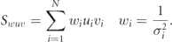
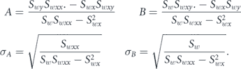
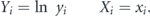
In this paper, we use error analysis and curve fitting to analyze the progression of COVID-19 [14–17]. In weighted least squares curve fitting for linear functions one finds the fit parameters, A, B, ..., which minimizes χ2, which depends on the location of data points xi, the measured values yi, and the uncertainties in yi given by σi.
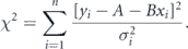
To fit a straight line model, one solves for A and B by calculating  and
and  and solving the resulting system of linear equations. We use the notation,
The uncertainties in the parameters can also be directly computed using propagation of error.
There are different methods to visualize the progression of the number of positive cases. Typically one uses linear plots, semilogarithmic plots, or log–log plots. Keep in mind several things when interpreting functions on a log–log plot. Exponential growth on a log–log plot appears exponential, and power-law growth on a log-log plot appears linear. If we define two transformations then we just have to fit linear functions. Transformation 1 is

For a power law function y = αxβ then

We refer repeatedly to β in this paper as the power-law exponent for the data region of interest.
If we define transformation 2
For an exponential function y = y(0)erx then

By propagation of error and the square root N rule, the weighting is  in both transformations even though there are no explicit errorbars in reports of positive cases.
2.2. Logistic curves
The logistic function is the solution to the differential equation, which models many different phenomena such as population growth.
We write the solution in several ways that depend on three parameters.
For short times, N increases exponentially. For long times, N is exponentially approaching a plateau. The logistic curve can be fitted by the Levenberg–Marquardt method.
2.3. Data sources and synchronization
Data was collected from Johns Hopkins [18], the European Centre for Disease Prevention and Control, and Wikipedia. The data files differed on the same days, probably due to how the start of a day is defined or lack of proper reporting. A small number of errors were found in all three data sources, such as the number of cases decreasing on a successive day. Some Wikipedia pages miss the death totals or recoveries, but we consider only positive cases in this paper.
Wikipedia data aggregation appeared to have the best-curated early time data, so it was the only data used for the analysis. Different countries have staggered outbreaks in time, and fitting power-laws depends on the origin of time. For synchronization between countries, an exponential fit to the first 1000 cases was performed. The initial time was an extrapolation of this curve to one case.
2.4. Moving window procedure and visualizations
To visualize COVID-19 progress, we track the slope of the number of cases on a log–log plot, which is an exponent β. Using a 7 d or 14 d window did not result in much difference. In this visualization, when β nears zero, the disease is mitigated. When β is large, this indicates a country is going into more danger. If β drops significantly below one and then increases again, this can define a second wave.
A visualization method developed by Bhatia is simple to implement and surprisingly effective [11]. In this method, one plots points of the number of cases in the last week on the logarithmic y-axis versus the total number of cases on the logarithmic x-axis. The visualization is a parametric plot eliminating time. Most of the time, the data perfectly line up and progresses upwards and to the right as things get worse for a country. If the plot moves downwards, this indicates mitigation. The noise in actual measurements only modulates the spacing between points but does not impact the general shape of the visualization much.
3. Results
3.1. SIA model
Epidemiological mathematical models are only as good as their assumptions. Some more sophisticated models beyond SIR might include different compartments like frontline workers F in hospitals or supermarkets who have an increased rate of infectivity. Quarantined individuals Q could be isolated from infecting others after being detected by tests. Exposed individuals E could have a time delay before switching to infected. Super spreaders Z could infect at a higher rate because they do not know they are sick and do not go into quarantine. Adding more sophisticated compartments may seem more realistic, but comes at the cost of more complicated differential equations and more model parameters to be determined.
The SIA model introduced here is probably the most simple way of getting at the logistic equation, similar to what was observed in China. This is only intended to work during lockdowns or with effective social policies. S stands for susceptible, I stands for been infected in the past, and A stands for avoiders. Avoiders are good with hygiene, staying away from sick people, and wearing masks not to get infected. Using avoiders is similar to neglecting recoveries in the SIR model with a different population size.

Then
One can use r = μK which gives
This derivation gives a logistic curve with reduced carrying capacity than the entire population, but does not suggest a way how to estimate K a priori.
In reality, there are probably different categories of people, depending on a complicated way of social interaction networks and behavior that cannot easily be quantified. This model provides a logistic curve, but many SIR model situations are also a similar form. Often in SIR, the effective value of K is of the same order of magnitude as P, whereas in SIA, one can easily achieve K ≪ P, which is different. Once restrictions are eased, then the curve would restart by not considering the previous cases anymore with new parameters in a possible second wave. Also, if there is significant travel between countries, one would expect this model to breakdown.
3.2. China and logistic growth of disease spread
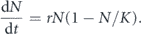
The SIA model may describe the logistic growth of positive cases in China. The reported cases follow a smooth curve once the correction for chest x-ray diagnoses is considered [13]. After the synchronization procedure, one finds in figure 1 the following parameter values.
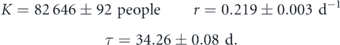
The fit seems reasonable on order 200 d. The genetic algorithm Eureqa also found a logistic curve for the simplest best fit function when running overnight. Most of the increase happens during a 15–20 d period, which may be why neglecting recoveries in SIR is reasonable. China is very strict on travel, but new cases trickle in at later times.
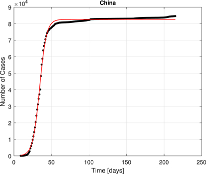
Figure 1. The mainland China data fit to a logistic curve after synchronization.
Download figure:
Standard image High-resolution image3.3. Representative analysis of nine countries
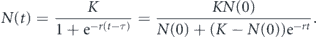
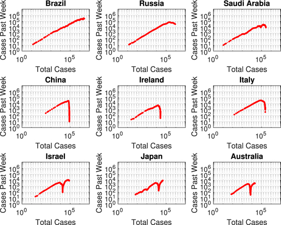
The number of positive cases was investigated with four analyses: early time exponential synchronization, overall power-law growth, the Bhatia visualization, and the β visualization. Nine representative countries are shown here in the results and all 27 in the supplementary materials (https://stacks.iop.org/PB/17/065005/mmedia). Brazil, Russia, and Saudi Arabia are examples of countries that are primarily still in the power-law phase or just exiting it. China, Ireland, and Italy have progressed to the logistic phase. Israel, Japan, and Australia are examples of a second wave after the logistic phase without a saturation.
Figure 2 illustrates the early time exponential phase and power-law growth. In no case does COVID-19 transmit like a pure runaway exponential function to the entire population. The power-law phase extends the longest for Brazil over many powers of 10 because they were slow to implement effective policies. The initial synchronization is not always possible in a satisfactory way due to a lack of data or irregularities. The mean initial exponential growth rate is about 0.25 ± 0.11 per day for 27 countries. An overall power-law exponent was computed for the region of cases that appears linear on the synchronized log–log plot in table 1. The mean overall power-law exponent for all 27 countries is 5.57 ± 0.98 suggesting there is a similarity in the cases' trajectories after synchronization.
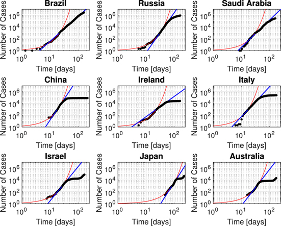
Figure 2. 4 stages of COVID-19 pandemic. Red curve—fit to initial exponential phase. Blue curve—fit to power-law in the intermediate region. Brazil, Russia, and Saudi Arabia are indicative of the power-law growth phase. China, Ireland, and Italy exit the power-law phase to the logistic growth in a third phase. Israel, Japan, and Australia exit the logistic phase into the second wave in the fourth phase.
Download figure:
Standard image High-resolution imageTable 1. Data for the overall power law exponent β for the indicated case range, the synchronization time shift t0, and the early time exponential growth constant r1.
| Country | β case range | β | t0 (d) | r1 per day |
|---|---|---|---|---|
| Afghanistan | 102–104 | 5.52 ± 0.02 | −29.4 | 0.106 ± 0.001 |
| Australia | 102–5 × 10³ | 6.13 ± 0.04 | −16.2 | 0.191 ± 0.003 |
| Austria | 102–5 × 10³ | 5.11 ± 0.04 | −6.6 | 0.314 ± 0.006 |
| Belgium | 102–104 | 5.88 ± 0.03 | −11.4 | 0.249 ± 0.006 |
| Bolivia | 102–5 × 10⁴ | 5.55 ± 0.01 | −32.3 | 0.087 ± 0.001 |
| Brazil | 103–106 | 4.25 ± 0.01 | −1.3 | 0.318 ± 0.006 |
| Canada | 102–105 | 6.94 ± 0.04 | −7.4 | 0.215 ± 0.003 |
| China | 102–104 | 7.12 ± 0.05 | −8.9 | 0.376 ± 0.009 |
| Czechia | 102–103 | 5.48 ± 0.16 | −6.4 | 0.271 ± 0.005 |
| Egypt | 5 × 10²–5 × 10⁴ | 4.98 ± 0.01 | −35.1 | 0.114 ± 0.002 |
| France | 102–5 × 10⁴ | 5.03 ± 0.01 | −8.7 | 0.345 ± 0.008 |
| Germany | 102–5 × 10³ | 5.95 ± 0.05 | −8.6 | 0.315 ± 0.007 |
| Guatemala | 102–104 | 6.60 ± 0.02 | −36.4 | 0.075 ± 0.001 |
| Ireland | 103–104 | 3.43 ± 0.02 | −5.5 | 0.295 ± 0.005 |
| Israel | 102–5 × 10³ | 5.81 ± 0.04 | −7.6 | 0.252 ± 0.005 |
| Italy | 102–5 × 10⁴ | 4.97 ± 0.01 | −6.2 | 0.399 ± 0.011 |
| Japan | 102–104 | 7.40 ± 0.02 | −48.2 | 0.082 ± 0.001 |
| Netherlands | 102–104 | 5.31 ± 0.03 | −9.7 | 0.272 ± 0.006 |
| Oman | 102–105 | 4.78 ± 0.01 | −29.9 | 0.108 ± 0.002 |
| Peru | 102–105 | 5.18 ± 0.01 | −18.9 | 0.162 ± 0.003 |
| Portugal | 102–5 × 10³ | 5.32 ± 0.05 | −4.1 | 0.319 ± 0.006 |
| Russia | 102–5 × 10⁴ | 6.75 ± 0.01 | −5.4 | 0.319 ± 0.006 |
| Saudi Arabia | 102–5 × 10⁴ | 4.60 ± 0.01 | −8.6 | 0.224 ± 0.004 |
| Spain | 102–104 | 6.54 ± 0.04 | −3.3 | 0.385 ± 0.009 |
| Switzerland | 102–104 | 5.44 ± 0.03 | −7.2 | 0.294 ± 0.006 |
| Turkey | 102–5 × 10⁴ | 3.78 ± 0.01 | −1.8 | 0.591 ± 0.015 |
| United Kingdom | 102–5 × 10⁴ | 6.52 ± 0.01 | −8.1 | 0.247 ± 0.005 |
| Mean value | 5.57 ± 0.98 | −14 ± 13 | 0.25 ± 0.12 | |
| Median value | 5.48 | −8.6 | 0.252 |
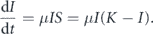
Figure 3 illustrates the β visualization for the same nine countries. Using a 7 d (red) or 14 d (green) window does not lead to much difference. The β always starts high then decreases. One can see the second wave as a decrease in the power-law exponent that later increases significantly above one. China seems to avoid a second wave due to strict policies, but second waves remain to be seen in several more months for most other countries.
Figure 3. β progression in the same countries. The 7 d window (red) mostly superimposes with the 14 d window (green). Low β indicates mitigation. High β indicates dangerous power-law growth. For the last three countries, β indicates the onset of second waves. Ireland and Italy appear to have slowly increasing β after the first wave, but not yet the full onset of a second wave.
Download figure:
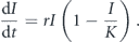
Standard image High-resolution imageFigure 4 illustrates the Bhatia visualization. There is no time parameter on the plots, but one sees the second wave as a drop then an increase in the curve. Most countries fall along the same initial line during the power-law phase. If the reopening of countries is only a delay in the progression, the curve will rise back up and continue along the same initial line. The β visualization is noisier than the Bhatia visualization because it depends explicitly on time.
Figure 4. Bhatia visualization of the same nine countries. When the curve goes down it indicates mitigation. In the last three countries, the uptick of the curve indicates a second wave.
Download figure:
Standard image High-resolution image
4. Discussion
The status of the COVID-19 pandemic is better understood by how new cases change over time rather than the absolute totals. The Bhatia and β visualizations are independent indicators of where countries stand and progression into possible second waves. The optimistic SIA model leading to saturating logistic growth only appears to work while lockdowns and strict social measures are maintained like in China. Every time restrictions change significantly in a region, new model parameters, and a reset of the initial conditions are required.
In many affected countries, a pattern of exponential growth, power-law growth, logistic growth, and possible second waves emerges from this survey. About half the hotspot countries above 10 000 cases follow a more irregular pattern that is difficult to model. Early data irregularities in reporting and noise make it often hard to synchronize countries, but an intermediate power-law growth exponent of about 5.6 appears similar between countries over that phase. Since countries besides China have similar policies, it seems likely that most countries who had COVID-19 under control will potentially see at least a reduced second wave because they act similarly. Travel restrictions should be an important consideration.
There are issues with choosing positive cases or deaths to track COVID-19. Usually, only sick people receive tests. Some people are positive but exhibit mild or no symptoms, so never seek out a test. Many regions may only have a limited throughput of testing, but it does not seem to be a bottleneck in most countries. Positive test data requires the same standards and protocols over time to be reliable. Positive testing results must also be made publicly available and not falsified to be useful. Deaths occur delayed from the original infections, and there are lower totals than positive cases. As infrastructure becomes overburdened, death rates can increase. Death rates also depend on demographics and individuals' general quality of health. Whether considering positive cases or death rates, scientists should keep their options open in tracking COVID-19.
It appears there is no simple social policy allowing most countries to go back to complete normality. The current pressing issues are how prevalent reinfection can be, the future availability of vaccines, the development of drugs that stop death, and what to do about future waves. Concerning vaccines, questions arise about efficacy, their mass production, delivery, or even if everyone will accept to use them. Modeling suggests that the number of actual positive cases has been significantly underestimated, but is well below 50 percent [6]. Therefore, there is still more modeling to be done and science to do to save lives.
Acknowledgments
I would especially like to thank Michael Sixt for encouraging me to think about these problems while working at home due to restrictions in place. I want to thank Nick Barton, Katka Bodova, Matthew Robinson, Simon Rella, Federico Sau, Ivan Prieto, and Pradeep Kumar for useful discussions.