
Abstract
Access to good public transit for low-socioeconomic communities has been an important concern in transportation planning and urban studies research. In Portland, Oregon, USA, the rapid growth of housing prices and rents in the urban core has caused displacement of low-income residents to peripheral and suburban neighborhoods where housing is more affordable. Because public transit is generally more limited in the urban periphery and suburbs, there is concern that the low-income suburban residents may have more limited access to Portland’s light rail transit service than more affluent residents do. This study examines the relationships between the light rail transit accessibility and socioeconomic status—income, race and ethnicity—in the Portland metro area. Light rail transit accessibility is compared for all income and racial/ethnic groups across four access zones. Multinomial logistic econometric models were used to measure likelihood differences of being located in different access zones between each demographic group. The results show that there is no significant barrier for low-income and racial and ethnic minority residents to access urban rail transit in Portland. The results suggest that despite low-income residents’ movement to the suburbs, Portland’s urban rail transit system continues to serve all residents by providing cohesive connections between the urban core, periphery and suburbs.
1 Introduction
Accessibility is a measure of how easily people can travel from the origin to the destination [1]. Public transit services are indispensable for low-socioeconomic groups to access jobs, services, and amenities because they often cannot own a personal vehicle. Hence, public transit systems help reduce social and economic disparities. Access to public transit directly affects the accessibility of those who depend on it. In this paper, we define public transit accessibility of residents as travel distance between residence and the closest transit stops.
In the United States, social and economic status has a strong relationship with the race and ethnicity. Despite the American values of democracy and freedom, a large share of the communities of color does not yet enjoy as much wealth as White Americans [2, 3]. Central urban neighborhoods have been increasingly upgraded in rapidly growing American cities as they attracted residential and commercial developments, jobs, and investments. As a result, low-income residents have had to relocate to the peripheral and suburban areas to seek affordable housing.
There have been on-going debates whether low-income and minority communities have poorer accessibility to public transit services than wealthier and majority ethic groups. Some researchers find that low-income households are concentrated near transit facilities since the cost of public transportation use is cheaper than automobile ownership [4]. However, others contend that the neighborhoods with high concentration of low-income and minority population usually lack access to public transit services. Therefore, the transit accessibility for the underrepresented groups has become weaker [5,6,7,8,9].
The history of racial segregation in Portland traces back to 1950s. Federally backed redlining, which banned mortgage lending in the “high-risk” areas or the neighborhoods where a large number of people of color lived. That resulted in the flight of wealthier White residents to the suburbs. At the same time, Albina, the northern neighborhood in the city of Portland, became a low-income Black American concentrated community. Since the 1990s, the pattern of segregation has been reversed. The city council of Portland implemented the Albina Community Plan in 1991 to beautify the streets and sidewalks and to redevelop and restore vacant lots in the area. Since then, public and private capital have flowed to Albina, the traditionally Black community, and other urban neighborhoods. Urban regeneration projects increased the property values in the urban core areas, which resulted in the influx of wealthier White residents. A tremendous number of Black residents who could not afford the rapidly rising housing prices and rents moved out from Albina and joined the poorer migrant communities in the peripheral East Portland [10]. Black and Latino communities are becoming more concentrated in suburbs [7, 9], similar to Framer’s [6] study that working class and minority residents in the Chicago metropolitan area tend to live in the inner-ring suburbs where a large stock of affordable housing is located.
This study aims to analyze the public rail transit accessibility for low-income and minority communities in the Portland metropolitan area. We begin with a literature review to illustrate the on-going studies about transit accessibility issues for underrepresented communities. Section 3 introduces the urban rail system in Portland metro area and illustrates the demographic trends since 2000. Then, we delineate the methodology for the analysis. In Sect. 4, we describe research design, the data, variables and an empirical model we use to answer the research questions. We discuss analytical results and the implications in Sect. 5. Finally, our analysis also recommends plans and strategies to enhance accessibility for diverse communities.
2 Literature Review
The poor are more likely to live in households without automobiles than the middle and upper classes [11]. That implies that low-income households are highly dependent on public transportation. Low-income residents and communities of color face challenges to use public transit systems in suburbs that lack such options [9]. In Chicago, the far South Side neighborhood has no direct access to rapid transit [6]. Since the 1970s in the Paris metro area, housing and services have been redistributed to the urban periphery and suburban neighborhoods. As a result, there is a significant mismatch between homes and workplaces [12]. Thus, limited transit services in the automobile-oriented suburbs significantly undermine accessibility and mobility of the disadvantaged [9, 12]. A case study covering Atlanta, Boston, Detroit, and Los Angeles has shown a large proportion of low-skilled jobs are in locations where public transit is lacking [13]. Revington and Townsend [14] also find that affordable rental housing is concentrated outside of transit catchment zones in Vancouver and Montreal, Canada.
However, other researchers suggest that underrepresented groups enjoy fair access to public transit services as much as other groups. They argue that low-income households are more likely to live near bus stops or railway stations to avoid the heavy burden of car ownership [4]. A research analysis that examines spatial and temporal accessibility by different social groups argues that low-income groups have equal or better access to transit services in the Greater Toronto and Hamilton area [15].
Researchers agree that public transit helps low-income and minority communities achieve social and economic opportunities. Public transportation modes enable the groups to access goods, services, and jobs without a heavy cost burden of automobile ownership [9, 14]. In particular, rail transit provides a greater level of accessibility and mobility than bus systems because of its reliable and timely service [16]. An increase in accessibility to public transit improves labor market outcomes [17, 18]. Moreover, improving transit accessibility reduces wage disparities [19]. An empirical result suggests that the rail transit service in San Francisco increased the minority employment rate in the urban core by connecting them to firms in suburbs where new rail stations were built [20].
The urban regeneration since 1990s has been highly associated with the urban rail transit development in Portland, Oregon. The Portland public rail system has one of the most extensive and well-integrated public transit networks in the US. The metropolitan council has been heavily investing in the development and operation of the transit systems [9]. TriMet, the region’s public transit agency operates Metropolitan Area Express (MAX) light rail lines that currently run 60 miles and serve 97 stations across the metropolitan area. Comprehensive connectivity among bus, commuter rail, and streetcar systems, which are also operated by TriMet, enhances access to the light rail lines. Further, MAX lines have attracted developments in close proximity to the rail facilities [21].
Rail transit projects have become a priority for many public transit agencies and local governments in the US. Urban rail transit is perceived to be faster and more reliable than other public transportation modes. Moreover, governments can expect reduction in traffic congestions and improvement in air quality through the increase in rail transit ridership. In addition, there is a widely accepted belief that rail infrastructure effectively catalyzes urban revitalization. Rail transit development can potentially strengthen the real estate market and benefit the property owners. That could improve image of the city. However, while many cities are focusing investment in rail systems, the share of low-income and minority riders is much lower in rail transit than in local buses [16, 22, 23]. The poor may have a disadvantage in accessing important destinations due to the slow travel time with buses [24, 25]. For example, inequalities in job access by train increased in Paris metropolis between 1975 and 2010 [12].
The debate whether public transit is less accessible to low-income and minority groups than wealthier white communities is still inconclusive. The improvement in research methods may reveal reasons for the inconsistency. Currently, most studies only focus on one or two most disadvantaged groups. They compare the lowest-income residents or low-skilled workers to other groups [12, 14]. In terms of racial inequity, many studies only consider Black and Latino communities as disadvantaged groups [9]. It is possible that moderate-income group or Asians face accessibility issue, too. It is difficult to understand a comprehensive demographic trend in transit accessibility without analyzing all income, racial, ethnic groups.
In addition, the literature shows that studies often take an everything-or-nothing approach in defining transit accessibility. They regard only one catchment area near a transit stop as an accessible zone. Therefore, outside of the zone is considered inaccessible to transit services. One can ask two questions. Will or can some of the people outside the zone walk to the stations? Moreover, can people who live outside of the zone still access stations if they ride a bicycle or a bus? A distance-decay function proved that among the people who live outside of the conventional accessible distance threshold (0.5 miles) to Metro stations in Madrid, Spain, a significant number walked to use the Metro station within 1500 m (0.93 miles) [26]. An analysis on Dutch urban rail transit found that riders use bike and other public transit modes to access rail stations when they live farther than walkable distance but less than 4100 m (2.55 miles) [27].
3 Study Area
The study area is the area inside the Portland Urban Growth Boundary (UGB) of the Portland metropolitan area. The Metropolitan Council of Portland created UGB in order to manage urban growth and protect the forests and agricultural lands in the region [28]. Most of the public transit systems are operated within the boundary. The public transit services are extremely scarce outside of UGB [9]. Therefore, this research analysis only focuses on areas in any parts of Clackamas, Multnomah, and Washington Counties that fall into UGB (Fig. 1). In this section, we also illustrate the demographic trends in the City of Portland and the suburban areas in UGB.

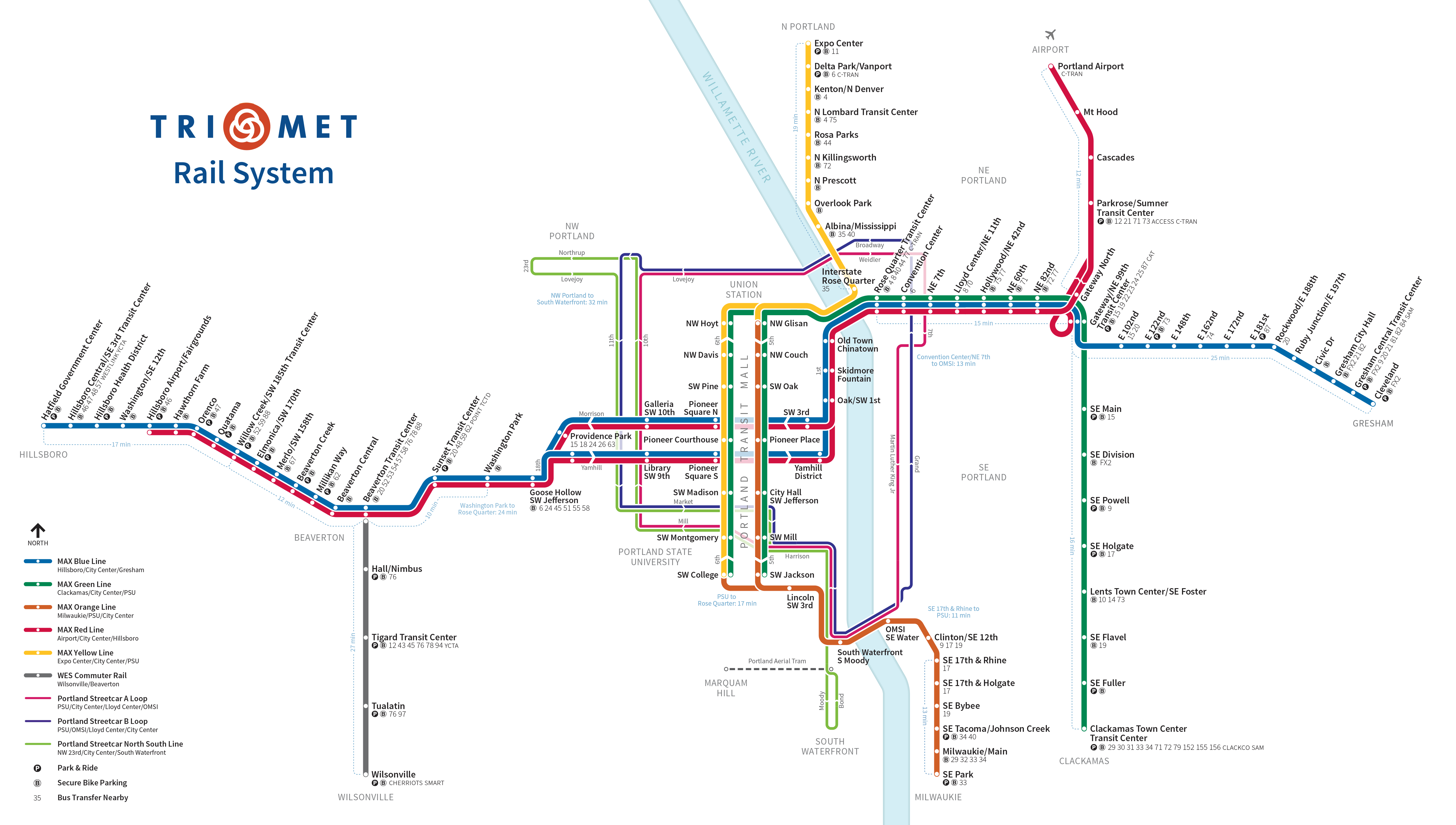
Source: TriMet, https://trimet.org/maps/img/railsystem.png
Metro Area Express (MAX) networks.
3.1 Portland, Oregon
The city of Portland is home to 648,000 residents according to the 2017 US Census estimation. The Metropolitan Statistical Area has a population of 1.9 million, which makes the region the 25th most populous metropolis. The largest racial group is non-Hispanic White. They comprise 74% of the total population. Other racial and ethnic groups are 12% of Latinos, 2.9% of Blacks and 6.5% of Asians. The share of residents living under the poverty level is 13.3% in the metro area. However, the proportion is higher (16.9%) in the City of Portland [29,30,31].
The Portland metropolitan area has extensively connected public transit networks (Fig. 1). Metropolitan Area Express (MAX) is the light rail system serving the metropolitan area. The MAX system comprises 5 lines that run 60 miles of tracks across the metropolitan area. Eastside Blue line, one of the first light rail projects in the nation, opened in 1986. The project catalyzed about $4.7 billion development and revitalization, especially in the downtown area. Westside Blue line also attracted residential and commercial developments since its opening in 1998. Combining the Westside and Eastside Blue lines, MAX connect between Hillsboro, the western suburb, and Gresham, the eastern neighborhood to the City of Portland. The Westside Express Service (WES) commuter line connects between the western and southern suburbs. The line also connects to MAX lines. In addition, streetcars and trams also contribute to convenient commute in downtown Portland. The 80 bus lines connect between rail, streetcar and tram systems. The metro area enjoys more than $13.2 billion developments in close proximity to the collective urban rail lines since the first decision by the public officials for the urban rail projects in 1978 [21].
3.2 The Demographic Structure
The inner city is experiencing an influx of wealthier White residents while the urban peripheral neighborhoods such as East Portland and many of the suburbs are increasingly having a large number of the poor and people of color [10]. In Portland, 82nd Avenue is the border line between the inner city and East Portland (Figs. 2, 3). Any neighborhoods to the west of 82nd Avenue are all regarded the inner city neighborhoods in the city [32]. Developers and investors concentrated commercial and residential developments to the inner city, especially in the areas in close proximity to the rail lines. Therefore, the neighborhoods have experienced a stark surge in housing values. An example is the Transit-Oriented Development (TOD), which is part of the Albina Community Plan. The project rejuvenated the streets and structures in the central neighborhoods. However, the flip side of the coin is that a large number of low-income and Black residents had to leave their neighborhoods due to the growing housing cost burden. Instead, they moved out farther from the inner city to East Portland and other suburban areas to seek affordable housing [9, 10].

The Portland metro area within UGB in 2000

The Portland metro area within UGB in 2015
The US Census data also reaffirm the trends (Figs. 2, 3). The Portland metropolitan area within the UGB experienced 19% population growth between 2000 and 2015. As the population grew, the poverty rate increased in the metro area (Table 1). In particular, the poverty rate in the urban periphery (East Portland) and suburbs increased much more dramatically than in the inner city. The poverty rate jumped from 11.5 to 20.1% in East Portland (Table 4). Likewise, suburbs experienced a considerable increase in poverty rate from 7.8 to 12.8% (Table 5). On the other hand, the increase in the inner city was only 2% points (Table 2). In 2000, the suburban neighborhoods in Portland had a traditional demographic structure of many American metropolises [10]. The dominant population was White Americans (80.3%) and the poverty rate was lower (7.8%) than the entire metro level (10%) (Tables 1, 5). By 2015, East Portland and the suburbs became ethnically diverse and the poverty rate was almost same as the metro area (Figs. 2, 3). On the contrary, the share of Black residents dropped from 7.2 to 5% during the period in the inner city (Table 2). For example, Albina area in the inner city, a traditional Black neighborhood, lost 6800 Black residents even though it gained total population. Percentage of Black drastically halved from 23.6 to 13.6% (Table 3). At the same time, share of Black surged from 2.2 to 5.1% in East Portland (Table 4). A large number of Latinos migrated to the metro area in recent decades. The population grew by 78.8% in the metro area (Table 1). Latino is the largest ethnic minority group in the inner city, East Portland and the suburbs. Yet, the share in East Portland (15.1%) and suburbs (14.9%) was as twice as the percentage in the inner city (7.5%) in 2015 (Tables 2, 4, 5). McKenzie [9] argued that there is a limited the urban rail transit in the urban periphery and suburban neighborhoods. He found in his analysis that Latino and Black communities faced disadvantages to access the transit services including the urban rail system in the Portland metropolitan area.
4 Methodology
The methodology section introduces how we redefine rail transit accessible zones. Moreover, we delineate the data and the data sources we use for our empirical analysis. Then, we explain the dependent and explanatory variables and the econometric model as tools to examine the accessibility differences among the demographic groups in all the transit accessible zones. Finally, the section lists hypotheses that are used to answer our research questions.
4.1 Research Design
The demographic data have shown that the urban regeneration has led to the increase in the poor and people of color outside the inner city Portland. While many jobs remain in the core [9], we want to explore if the development of public transit helps improve the accessibility of the poor and people of color. We have formulated two questions. Do ethnic and racial minorities have poorer accessibility than White population? Do low-income residents have poor accessibility than other income groups? In order to answer the questions, we compare population by census block group in three poverty levels (poverty, near poverty, and poverty-free) and four ethnic groups (White, Black, Asian, and Latino) in four tiered accessibility zones. The thresholds dividing the accessibility zones are based on distances between the centroid of a block group and the nearest rail transit station. For instance, if a block’s centroid is 2 miles away from the nearest station, the block is located in Zone 3. We create the zones based on the literatures that measured maximum walkable distance and the distance people bike or ride a bus to rail stations [26, 27]. Table 6 shows the four zones. Zone 1 represents the most accessible areas and Zone 4 represents the inaccessible areas to rail stations.
4.2 Data
This study requires data sets for demographic components, street networks and public transit facilities. The 5-year (2011~2015) American Community Survey (ACS) [30] data provides demographic data. Census Block Group is the smallest geographic unit among U.S. census data sets. The income to poverty ratio determines an individual’s poverty status. If the ratio is below 1.0, the person falls into the poverty group. The ratio at or above 1.0 and below 1.25 is considered ‘near poverty’ level according to U.S. Census Bureau [33]. An individual with ratio of at least 1.25 is in the poverty-free group. The demographic variables are percentages of racial and ethnic groups (White, Black, Asian, and Latino) and income groups (Poverty, Near poverty, and Poverty-free).
Transit facilities and networks data are from the Metro of Portland websiteFootnote 1 in GIS (Geographic Information System) format. Data sets include sidewalks, bike trails, locations of railway stations, bus stops, rail lines, and streetcar, tram, and bus routes. These GIS data sets are essential to conduct spatial analysis on the relationship between demographic characteristics and accessibility to urban rail transit. In Portland, multimodal connectivity of sidewalk, bike trails, and bus routes to the rail systems plays a significant role in measuring accessibility.
Hence, sidewalks, bike lanes and bus routes are used to calculate network distances between each block group and the nearest rail stations. ArcGIS Network Analysis measures distances from each block group centroid to the closest rail station through sidewalks and bike lanes to determine the first and the second accessibility zones. Sidewalks, bike lanes and bus routes are included in calculating distances to delineate Zone 3. The rest of the areas within UGB are in Zone 4 (Fig. 4).

Urban rail networks within the UGB
4.3 Variables and the Econometric Model
We use a multinomial logistic regression model to compare differences between income and racial groups and between multi-tiered accessibility zones. The method of maximum likelihood estimates the parameters. The model is powerful since it allows the inclusion of more than two nominal categories for a dependent variable. The dependent variable has four categories according to the distance thresholds. Zone 4 (inaccessible areas to rail stations) is set as a base level. The purpose is to study the relationship between the multinomial (the three accessible zones) likelihoods to the base level (the inaccessible zone) and compare all explanatory variables (all income and ethnic groups).
The explanatory variables are sets of all socioeconomic groups. The income variables are proportions of population in the ‘poverty,’ ‘near poverty,’ ‘poverty-free’ groups. The racial and ethnic variables are the proportion of population in the White, Black, Asian, and Latino groups. We include ‘poverty-free’ and ‘White’ variables in order to compare rail transit accessibility between the disadvantaged and wealthier communities. The comparison allows more detailed analysis on disparities in accessibility than studies only on underrepresented groups. Finally, the model includes control variables that are crucial factors to avoid omitted variable biases. The control variables are population density, neighborhood jobs, workers, renters, and households without a vehicle (Table 7).
The multinomial logistic regression with the variables above is:
where j = 1, 2, 3 (Zone number as explained in Table 8), i = 1, 2, 3, …, n (Census block group identification number), xp = control variables, Π denotes the likelihood that the dependent variable Y = 1 when explanatory variable X = x. For example, Π1 is the likelihood of a census block group to be located in the first zone depending on the effect of explanatory variable; income, race/ethnicity and other control variables. The likelihoods in a logistic model are expressed as:
Based on the rule of a logarithmic equation:
Therefore, results of the dependent variable are differences between likelihoods of being in zone j and zone 4. j is an identification of the accessible zone to rail transit stations. This method creates three logit models each for Zones 1, 2, and 3. In each model, the coefficients indicate likelihood to be located in a Zone j when compared to Zone 4, the inaccessible areas to rail transit stations. A positive value implies the likelihood of a demographic group to be within the accessible zone grows against the likelihood to be in inaccessible areas when percentage of the group increases. A negative coefficient means that a neighborhood’s likelihood to be located in the accessible zone decreases against the likelihood of being in the inaccessible zone when percentage of the group increases. In multinomial logit regression, magnitudes of coefficients are not as important as signs. A dependent variable is likelihood differences between two categories rather than a single likelihood. Hence, a large magnitude is not interpreted as high likelihood in multinomial logit estimation [34].
We also compare between Zones 1, 2, and 3 using the logistic modeling results. The first three models are subtracted to each other. For instance, by subtracting the Zone 2 model from the Zone 1 model, we can compare the likelihood of being in Zone 1 against the likelihood to be located in Zone 2.
4.4 Hypotheses
The previous studies suggest that low-income or minority individuals displaced from the urban core area to the periphery and suburbs. The groups of people have poorer access to rail stations than wealthier and White individuals [9, 10]. The hypotheses are established based on the argument. First, we hypothesize that communities of color (Black, Latino, and Asian) is more likely to live in areas with limited access to the urban rail transit. By contrary, White residents are more likely to live in areas where they can access rail stations. We also examine the relationship between income and rail accessibility. Residents below poverty level and near poverty level are more likely to live in inaccessible areas to rail stations rather than living in the transit accessible areas. On the other hand, the likelihood of residents without poverty status being in rail accessible areas is higher than being in inaccessible zones.
5 Results and Discussion
The multinomial logistic model measures difference from the likelihood for each racial, ethnic and income group to live in rail transit accessible zones (Zone 1, 2, and 3) to the likelihood to live in inaccessible zone (Zone 4). To enable the multiple comparisons, multinomial logit estimation automatically generates three logistic models. That said, the three dependent variables are the likelihood difference between Zone 1 and Zone 4 (Π1–Π4), the difference between Zone 2 and Zone 4 (Π2–Π4) and the difference between Zone 3 and Zone 4 (Π3–Π4). Since the models are all derived from one model (Eq. 1), their Akaike Information Criteria (AIC = 1895.95) are all equal. Thus, the goodness of fit of the three models is equal, which means comparing the fitness is unnecessary. In the analysis using the multinomial logit model, the magnitude of coefficients itself does not tell much information as the dependent variable is likelihood difference between categories rather than likelihood itself. What we need to pay attention the sign of coefficients. As we mention in the sect. 4.3, the positive coefficient indicates higher likelihood for a group to live in rail transit accessible zones than to the likelihood to live in inaccessible zone. The negative estimator means that the demographic group is less likely to live in accessible zones than in inaccessible zone. For example, the coefficient for Latino to predict the difference between Zone 2 and 4 (Π2–Π4) is − 0.852. The interpretation is that Latino community is less likely to live in Zone 2 than in Zone 4.
The results show that all income and racial/ethnic variables are statistically significant to the dependent variable (Table 8). The likelihood of Black residents to live in rail transit accessible zones is higher than their likelihood to live in inaccessible zone. The results for other communities of color are more complicated. Latino community is more likely to live in Zone 1 than in Zone 4. However, Latinos are less likely to live in Zone 2 and Zone 3 than in Zone 4. Asians also have a higher likelihood to be in Zone 1 than in Zone 4 and lower likelihood to be in Zone 2 and 3 than in Zone 4. The residential patterns for Whites are similar to Latinos and Asians. Whites are more likely to live in Zone 1 than in Zone 4. However, the likelihood to live in Zone 2 and 3 is smaller than the probability to be in Zone 4. The light rail stations are readily accessible to Latino, Asian and White groups when we only consider Zone 1, the 0.5 mile threshold. However, they have a tendency to reside in inaccessible areas to stations than in areas that are moderately walkable distance (Zone 2) and that accessible through multimodal transportation to the rail stations (Zone 3).
Coefficients for income groups also have some unexpected signs (Table 8). There is a lower likelihood for people under poverty level to live in Zone 3 than in Zone 4. However, they are more likely to live in Zone 1 and 2 than in Zone 4. Near poverty group (Income to poverty ratio 1~1.25) has a better accessibility than other income groups. The people under near poverty have higher likelihood to live in all accessible zones (Zone 1, 2, and 3) than in inaccessible zone (Zone 4). People who are free from poverty show a similar pattern as poverty group. Residents without poverty or near poverty are more likely live in Zone 1 and Zone 2 than Zone 4 while they are less likely to live in Zone 3 than Zone 4. The overall outcomes for the control variables follow what we hypothesize (Table 8). Employed residents have higher likelihood to be located in accessible zones than inaccessible zone. Moreover, households without a car are more likely to be located in Zone 1 and Zone 2. However, they are less likely to in Zone 3 than in Zone 4. The households without a car in Zone 4 can be disadvantaged in going to necessary destinations due to the limited public rail transit accessibility. Renters are also more likely to live in Zone 1, 2 and 3 than in Zone 4. They are less likely to own a car than homeowners because renters often do not have a parking facility. Areas with more jobs tend to have closer proximity to rail stations. Jobs are more likely concentrated in Zone 1 and Zone 3 than in Zone 4. Although the sign for likelihood difference between Zone 2 and 4 is positive, the coefficient is not statistically significant. Further, neighborhoods where rail stations are readily accessible have high density. Areas with higher population density have greater likelihood to be located in Zone 1, 2, and 3 than in Zone 4.
Our data analysis generates mixed results that some of them contradict with the hypotheses. Overall, racial and ethnic minority groups have sound access to the rail infrastructure. In particular, Black residents enjoy superior accessibility to other groups. The probability for Blacks to live in all levels of accessible zones is higher than their probability to live in areas where rail transit access is considerably limited. Whites’ residential patterns vary depending on different zones. White residents are more likely to live within the most walkable distance threshold (0~0.5 mile) to rail stations than inaccessible zone. However, they are less likely to live in moderately accessible thresholds (0.5~2.55 miles) than the areas with limited access (over 2.55 miles) to rail transit. The same patterns apply to Latinos and Asians. Although the results prove the hypotheses about Zone 2 and 3, they show an opposite sign from hypotheses about Zone 1. The results for different income groups also suggest opposite signs from some hypotheses. It turns out that poverty and near poverty groups have good overall accessibility, except the poverty group is less likely to live the accessible zone through multimodal transportation (0.93~2.55 miles) than the areas with limited access to rail transit. The wealthier residents have strong accessibility in Zone 1 and 2 as we expected. However, they show lower probability to live in areas that are accessible through bike and buses than in areas with the weakest accessibility to rail transits, which is an unexpected result.
It is evident that White residents are more concentrated in the inner city area than in East Portland and the suburbs. By contrast, the shares of communities of color are greater in the peripheral urban and suburban areas in inner Portland. Those neighborhoods experienced more rapid growth in minority residents than the inner city from 2000 to 2015. Although the poverty rate increased in the metropolitan area, it increased more drastically in East Portland and the suburban neighborhoods than in the inner city (Tables 1, 2, 3, 4, 5; Figs. 2, 3). By considering the demographic trend and structure, one could concern about poor rail transit accessibility for low-income and minority residents [9]. Our research analysis presents many signs that the underrepresented populations live in areas where there is good accessibility to the urban rail infrastructure. The rail transit lines extended to the East Portland and suburban neighborhoods at the same time of urban regeneration. The collective Eastside and Westside Blue lines connect the eastern (Gresham) and western ends (Beaverton and Hillsboro) of the metropolis. The Latino concentrated suburban neighborhoods in Hillsboro, Beaverton and Gresham are located in close proximity to the rail transit stations (Fig. 5). Likewise, high poverty neighborhoods in suburbs cluster near the rail stations (Fig. 6). The MAX urban rail of Portland provides wide networks that connect between the urban core, periphery and the suburban neighborhoods cohesively. In addition, the WES commuter rail line connects between the western and southern suburbs. It is one of few suburbs to suburbs rail transit lines in the United States [21]. Another aspect that contributes to the strong overall accessibility could be superior street network connectivity. Smart growth planning that limits development within UGB improved internal street and pedestrian connectivity in the Portland metro area since early 1990s [35]. We measure street network distances between block groups and rail stations rather than straight line distances to get realistic measures for accessibility. We can speculate the well-connected street networks make a wide range of people to have a strong access to the rail facilities. Our findings illustrate the urban rail transit in Portland is an intelligent system because it provides the necessary accessibility to everyone, including low-income and minority individuals. The urban rail transit helps the low-socioeconomic communities to have a strong accessibility.

Percentage of Latinos in 2015

Percentage of residents below poverty level in 2015
This case study of Portland suggests lessons to improve accessibility for a wide range of communities. First, an extensive urban rail infrastructure that connects the urban core, periphery, and the suburban neighborhoods can enhance accessibility of the low-socioeconomic groups. Second, our analysis shows a significant number of the low-income and minority residents in Zone 2 and Zone 3. These areas are still accessible to the rail stations even though they are not as close as Zone 1. A coordinated development of multimodal transportation infrastructure that links bicycles, buses and rail transit can further improve urban rail transit accessibility for the low-socioeconomic groups. These two levels of accessible areas should receive more attention from urban and transportation planners in developing smart and connected communities. In this case, Portland can be a model case for other cities because it allows riders to transfer between the rail and buses without paying separate fares. Moreover, the buses and rail cars have bicycle racks so that they provide easy access for bikers [36]. Finally, an additional minor would be well-connected street networks can enhance accessibility to urban rail transit.
6 Conclusion
It is clear that a great proportion of the low-income and minority residents is concentrated in East Portland and suburban neighborhoods, a result of the urban regeneration projects. Overall, our analytical results suggest that there is no significant barrier for low-income and racial and ethnic minority residents to access the urban rail transit in Portland. The Black group generally has better accessibility than other racial and ethnic groups. Poverty and near poverty groups also have superior access to rail transit than the poverty-free group. These results reflect that the extensive urban rail system is well connected to the peripheral and suburban neighborhoods where low-socioeconomic communities are concentrated. Portland can be a model city for many other cities with limited connectivity between urban core and suburban areas. While there are debates that urban regeneration introduces inequity issues, our study provides evidence to support the argument that an extensive public rail transit can remove accessibility barriers for low-socioeconomic groups.
Because Portland has an extensive multimodal system we divide the study area into four zones to consider the bus and bicycle connections to urban rail transit. Riders can transfer between rail and buses without a burden of separate fees for different systems. Further, the rail cars and buses accommodate bikers with bicycle racks. Our analysis could contribute to the debate on public transit accessibility and equity. The method allows us to look at the accessibility issues in a deeper and more comprehensive manner. In the study, we introduce different levels of accessible zones. That provides us more detailed analysis than a study only focusing one accessible area. Moreover, we consider accessibility issues for all economic and ethnic groups. The results make it possible to compare people in different groups.
This study only focuses on the distance between rail transit stops and the census block group centroid. We plan to conduct future analysis in accessibility from each household to transit facilities using parcel data. That will give more accurate results than the research using census block groups. Furthermore, a study on accessibility for senior citizens and people with disabilities can be valuable because public transit systems are both crucial for the populations who face physical challenge to use them. Finally, accessibility to jobs from households through the urban rail transit can shed a light on accessibility and economic opportunity for low-socioeconomic communities.
Notes
Metro of Portland, Data Resource Center, https://www.oregonmetro.gov/tools-partners/data-resource-center.
References
Sun Y, Lin HF (2015) GIS-based analysis of public transit accessibility: definition and display. COTA Int Conf Transp 15:1213–1224
Gradin C (2014) Race and income distribution: evidence from the USA, Brazil and South Africa. Rev Dev Econ 18(1):73–92. https://doi.org/10.1111/rode.12070
Richardson AS, Boone-Heinonen J, Popkin BM, Gordon-Larsen P (2012) Are neighbourhood food resources distributed inequitably by income and race in the USA? Epidemiological findings across the urban spectrum. BMJ Open 2:1–9. https://doi.org/10.1136/bmjopen-2011-000698
Glaeser EL, Kahn ME, Rapparport J (2008) Why do the poor live in cities? The role of public transportation. J Urban Econ 63:1–24. https://doi.org/10.1016/j.jue.2006.12.004
Covington KL (2015) Poverty suburbanization: theoretical insights and empirical analyses. Soc Incl 3(2):71–90. https://doi.org/10.17645/si.v3i2.120
Farmer S (2011) Uneven public transportation development in neoliberalizing Chicago, USA. Environ Plan A 43(5):1154–1172. https://doi.org/10.1068/a43409
Holzer HJ, Stoll MA (2007) Where workers go do jobs follow? Metropolitan labor markets in the US, 1990 to 2000. Brookings Institution, Washington
Howell AJ, Timberlake JM (2013) Racial and ethnic trends in the suburbanization of poverty in U.S. metropolitan areas, 1980–2010. J Urban Aff 36(1):79–98. https://doi.org/10.1111/juaf.12030
McKenzie BS (2013) Neighborhood access to transit by race, ethnicity, and poverty in Portland, OR. City Community 12(2):134–155. https://doi.org/10.1111/cico.12022
Goodling E, Green J, McClintock N (2015) Uneven development of the sustainable city: shifting capital in Portland, Oregon. Urban Geogr 36(4):504–527. https://doi.org/10.1080/02723638.2015.1010791
Tomer A (2011) Transit access and zero-vehicle households. Brookings Institution, Washington
Desjardins X, Drevelle M (2014) Trends in the social disparities in access to jobs by train in the Paris region since 1975. Town Plan Rev 85(2):155–170. https://doi.org/10.3828/tpr.2014.10
Stoll M, Holzer HJ, Ihlanfeldt K (2000) Within cities and suburbs: racial residential concentration and the spatial distribution of employment opportunities across metropolitan areas. J Policy Anal Manag 19:207–231
Revington N, Townsend C (2016) Market rental housing affordability and rapid transit catchments: application of a new measure in Canada. Hous Policy Debate 26(4–5):864–886. https://doi.org/10.1080/10511482.2015.1096805
El-Geneidy A, Buliung R, Diab E, van Lierop D, Langlois M, Legrain A (2015) Non-stop equity: assessing daily intersections between transit accessibility and social disparity across the Greater Toronto and Hamilton Area (GTHA). Environ Plan 43(3):540–560. https://doi.org/10.1177/0265813515617659
Taylor BD, Morris EA (2014) Public transportation objectives and rider demographics: are transit’s priorities poor public policy? Transportation 42(2):347–367. https://doi.org/10.1007/s11116-014-9547-0
Sanchez TW (1999) The connection between public transit and employment: the cases of Portland and Atlanta. J Am Plan Assoc 65:284–296
Alam BM (2005) Influence of transit accessibility to jobs on the employability of the welfare recipients: the case of Broward County, Florida. Dissertation, Florida State University. http://diginole.lib.fsu.edu/etd/45
Sanchez TW (2002) The impact of public transport on U.S. metropolitan wage inequality. Urban Stud 39:423–436. https://doi.org/10.1080/00420980220112766
Holzer HJ, Quigley J, Raphael S (2003) Public transit and the spatial distribution of minority employment: evidence from a natural experiment. J Policy Anal Manag 22:415–442. https://doi.org/10.1002/pam.10139
TriMet (2018) MAX light rail project history. https://trimet.org/history/maxoverview.htm. Accessed 22 Oct 2018
Brown J, Thompson G, Bhattacharya T, Jaroszynski M (2013) Understanding transit ridership demand for the multidestination, multimodal transit network in Atlanta, Georgia: lessons for increasing rail transit choice ridership while maintaining transit dependent bus ridership. Urban Stud 51(5):938–958. https://doi.org/10.1177/0042098013493021
Barton MS, Gibbons J (2017) A stop too far: how does public transportation concentration influence neighbourhood median household income? Urban Stud 54(2):538–554. https://doi.org/10.1177/0042098015593462
Giuliano G (2005) Low income, public transit, and mobility. Transp Res Rec 1927:63–70. https://doi.org/10.3141/1927-08
Taylor BD, Ong P (1995) Spatial mismatch or automobile mismatch? An examination of race, residence and commuting in US metropolitan areas. Urban Stud 32(9):1453–1473. https://doi.org/10.1080/00420989550012348
García-Palomares JC, Gutiérrez J, Cardozo OD (2013) Walking accessibility to public transport: an analysis based on microdata and GIS. Environ Plan 40(6):1087–1102. https://doi.org/10.1068/b39008
Debrezion G, Pels E, Rietveld P (2009) Modelling the joint access mode and railway station choice. Transp Res Part E 45:270–283. https://doi.org/10.1016/j.tre.2008.07.001
Metro of Portland (2018) Urban growth boundary. https://www.oregonmetro.gov/urban-growth-boundary. Accessed 18 Oct 2018
U.S. Census Bureau (2000) American Community Survey. http://factfinder.census.gov. Accessed 10 Oct 2018
U.S. Census Bureau (2015) American Community Survey. http://factfinder.census.gov. Accessed 10 Oct 2018
U.S. Census Bureau (2016) American Community Survey. http://factfinder.census.gov. Accessed 10 Oct 2018
McClintock N, Mahmoudi D, Simpson M, Santos JP (2016) Socio-spatial differentiation in the sustainable city: a mixed-methods assessment of residential gardens in metropolitan Portland, Oregon, USA. Landsc Urban Plan 148:1–16. https://doi.org/10.1016/j.landurbplan.2015.12.008
Center for Poverty Research, University of California, Davis (2017) How is poverty measured in the United States? https://poverty.ucdavis.edu/faq/how-poverty-measured-united-states. Accessed 7 Oct 2018
Hadi AS (2006) Regression analysis by example. Wiley, Hoboken
Song Y, Knaap GJ (2004) Measuring urban form: is Portland winning the war on sprawl? J Am Plan Assoc 70(2):210–225. https://doi.org/10.1080/01944360408976371
TriMet (2018) Rider’s guide: fares and how to ride. https://trimet.org/pdfs/languages/riders-guide.pdf. Accessed 29 Nov 2018
Open Access
This article is distributed under the terms of the Creative Commons Attribution 4.0 International License (http://creativecommons.org/licenses/by/4.0/), which permits unrestricted use, distribution, and reproduction in any medium, provided you give appropriate credit to the original author(s) and the source, provide a link to the Creative Commons license, and indicate if changes were made.
Author information
Authors and Affiliations
Corresponding author
Additional information
Communicated by Christopher Auffrey, Haishan Xia and Chun Zhang.
Rights and permissions
Open Access This article is licensed under a Creative Commons Attribution 4.0 International License, which permits use, sharing, adaptation, distribution and reproduction in any medium or format, as long as you give appropriate credit to the original author(s) and the source, provide a link to the Creative Commons licence, and indicate if changes were made.
The images or other third party material in this article are included in the article’s Creative Commons licence, unless indicated otherwise in a credit line to the material. If material is not included in the article’s Creative Commons licence and your intended use is not permitted by statutory regulation or exceeds the permitted use, you will need to obtain permission directly from the copyright holder.
To view a copy of this licence, visit https://creativecommons.org/licenses/by/4.0/.
About this article

Cite this article
Oh, S., Wang, X. Urban Rail Transit Provides the Necessary Access to a Metropolitan Area: A Case Study of Portland, Oregon, USA. Urban Rail Transit 4, 234–248 (2018). https://doi.org/10.1007/s40864-018-0095-3
Received:
Revised:
Accepted:
Published:
Issue Date:
DOI: https://doi.org/10.1007/s40864-018-0095-3